- CSS(Cascading Style Sheet),层叠样式表,用于渲染 HTML 元素标签的样式
- MDN CSS 文档 (opens new window)
# CSS 的引入方式
/* 使用内联样式:利用标签中 style 属性来改变每个标签的显示样式 */
<p style="background-color:#FF0000; color:#FFFFFF;">
    p 标签段落内容
</p>

/* 使用内部样式定义:在 <head> 中使用 <style>,对多个标签进行统一修改 */
<head>
    <style type="text/css">
        p {color:#FF0000;}
    </style>
</head>

/* 链接外部样式文件:在 <head> 中使用 <link/> 标签来引入外部样式文件 */
/* rel 属性规定当前文档与被链接文档之间的关系;type 属性被链接文档的 MIME 类型;href 属性规定被链接文档的位置 */
<link rel="stylesheet" type="text/css" href="mystyle.css" />

/* 在 <style> 中使用 @import 导入外部样式文件 */
<style type="text/css">
    @import url(mystyle.css);
    div {color:#FF0000;}
</style>
2
3
4
5
6
7
8
9
10
11
12
13
14
15
16
17
18
19
20
21
# CSS 语法
selector {
    property1: value1;
    property2: value2;
}
2
3
4
# 属性的值
- inherit(继承父元素的值)
- 预定义的值,如
left、right、none - 长度和百分数,如
3em、10px、100%(1 em 表示当前元素的字体尺寸) - 纯数字
- URL,如
url(bg-pattern.png) - CSS 颜色:预定义颜色关键字、十六进制数字、RGB、HSL、RGBA、HSLA(色相 hue、饱和度 saturation、亮度 lightness、透明度 alpha transparency)等格式表示的颜色值
!important:提升指定样式规则的应用优先权
# 属性继承
# 样式优先级
- 由上到下,由外到内,优先级由低到高
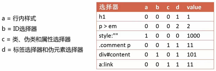
# 选择器
- 指定 CSS 要作用的标签
- 简单选择器
- 标签选择器
tag - class 选择器
.className - ID 选择器
#id - 属性选择器
[att]、[att=val]、[att~=val] - 伪类选择器
:link
- 标签选择器
- 伪元素选择器
::first-letter、::first-line、::before、::after、::selection - 组合选择器
- 后代选择器
selector selector - 子选择器
selector>selector - 兄弟选择器
selector+selector、selector~selector - 选择器分组
selector,selector
- 后代选择器
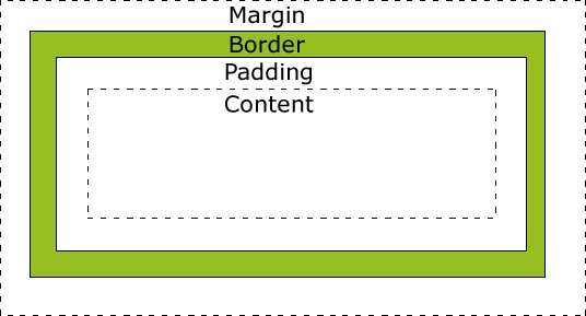
# CSS 盒子模型
CSS 盒模型本质上是一个盒子,封装周围的 HTML 元素,包括:
margin(外边距)- 清除边框外的区域,外边距是透明的
border(边框)- 围绕在内边距和内容外的边框
padding(内边距)- 清除内容周围的区域,内边距是透明的
content(内容)- 盒子的内容,显示文本和图像总元素的宽度=宽度+左填充+右填充+左边框+右边框+左边距+右边距
总元素的高度=高度+顶部填充+底部填充+上边框+下边框+上边距+下边距
div {
    background-color: lightgrey;
    width: 300px;
    border: 25px solid green;
    padding: 25px;
    margin: 25px;
}
2
3
4
5
6
7
# 常见属性
# 浏览器私有属性前缀
- Chrome、Safari:
-webkit- - Firefox:
-moz- - IE:
-ms- - Opera:
-o-
# 字体
- font-size: <length> | <percentage>:文字的字体大小
- font-family: [ <family-name> | <generic-family> ] #:文字的字体系列(<generic-family> = cursive | fantasy | monospace | serif | sans-serif)(可以使用 @font-face 规则定义字体)
- font-weight: normal | bold | bolder | lighter | <integer>:字体的粗细(normal 等价于 400、bold 等价于 700、100、200、300、400、500、600、700、800、900 )
- font-style: normal | italic | oblique:文字的字体风格(是否斜体)
- line-height: normal | <length> | <percentage> | <number>:行间的距离(行高)
- color:文字颜色
# 文本
- text-align: left | right | center | justify :文本水平对齐方式
- vertical-align: baseline | sub | super | top | text-top | middle | bottom | text-bottom | <percentage> | <length>:元素的垂直对齐方式
- text-indent: <length> | <percentage>:文本块首行的缩进
- white-space: normal | pre | nowrap | pre-wrap | pre-line:元素中的空白符的处理方式(pre 保留空格,wrap 保留换行)
- word-wrap: normal | break-word:当内容超过指定容器的边界时是否断行
- word-break: normal | keep-all | break-all:文本的字内换行行为
- word-spacing: normal | <length> | <percentage>:单词间距(单词间的空白)
- text-shadow: none | [ <length>{2,3} && <color>? ]#:文本阴影效果
- text-decoration: none | [ underline || overline || line-through || blink ]:文本修饰
- text-overflow: clip | ellipsis:clip:当内联内容溢出块容器时,将溢出部分裁切掉;ellipsis: 当内联内容溢出块容器时,将溢出部分替换为(...)
text-overflow: ellipsis; overflow: hidden; white-space: nowrap; - text-transform:文本大小写(uppercase、lowercase、capitalize)
- text-indent:文本块首行的缩进
- letter-spacing:字符间距
- cursor: [<url> [<x> <y>]?,]* [ auto | default | none | help | pointer| zoom-in | zoom-out | move:光标的类型
# 盒模型
- width: <length> | <percentage> | auto:目标对象的宽度
- height:目标对象的高度
- padding:[ <length> | <percentage> ]{1,4}:内边距(填充)(顺序 TRBL:上 右 下 左)
- margin:[ <length> | <percentage> | auto ]{1,4}:外边距(顺序 TRBL:上 右 下 左)(margin 合并:毗邻元素、父元素与第一个/最后一个子元素)
- border: <line-width> || <line-style> || <color>:边框(宽度 border-width、样式 border-style、颜色 border-color)
- border-radius: [ <length> | <percentage> ]{1,4} [ / [ <length> | <percentage> ]{1,4} ]?:圆角边框(水平半径、垂直半径)
- overflow: visible | hidden | scroll | auto:内容溢出元素框时的处理方式
- box-sizing: content-box | border-box:设置 width、height 指定的区域,默认 content-box
- box-shadow: none | <shadow> [ , <shadow> ]*:<shadow> = inset? && <length>{2,4} && <color>?:阴影
- outline:轮廓边框
# 背景
- background
- background-color: <color>:内容背景色,默认值:transparent(全透明)
- background-image: <bg-image> [ , <bg-image> ]*:背景图像,值
url(URL)或 none - background-repeat: <repeat-style> [ , <repeat-style> ]*:是否及如何重复背景图像,<repeat-style> = repeat-x | repeat-y | [repeat | no-repeat | space | round]{1,2}
- background-attachment: <attachment> [ , <attachment> ]*:背景图像是否固定或者随着页面的其余部分滚动,<attachment> = fixed | scroll | local
- background-position: <position> [ , <position> ]*:背景图像的开始位置,<position> = [ left | center | right | top | bottom | <percentage> | <length> ] | [ left | center | right | <percentage> | <length> ] [ top | center | bottom | <percentage> | <length> ] | [ center | [ left | right ] [ <percentage> | <length> ]? ] && [ center | [ top | bottom ] [ <percentage> | <length> ]? ]
- background-origin: border-box | padding-box | content-box:设置背景图像开始位置的参考原点,默认 padding-box
- background-clip: border-box | padding-box | content-box:背景图像向外裁剪的区域,默认 border-box
- background-size: [ <length> | <percentage> | auto ]{1,2} | cover | contain:背景图像的尺寸大小
# 布局
- display: inline | block | inline-block | none | table | flex | grid:元素的显示方式
- block(块级元素):默认宽度为父元素宽度,可设置宽高,换行显示
- inline(行内元素):默认宽度为内容宽度,不可设置宽高,同行显示
- inline-block:默认宽度为内容宽度,可设置宽高,同行显示,整块换行
- flex(弹性元素)
- visibility: visible | hidden | collapse:元素是否可见
- position: static | relative | absolute | fixed:元素的定位方式
- relative(相对定位):仍在文档流中,参照物为元素本身
- absolute(绝对定位):默认宽度为内容宽度,脱离文档流,参照物为第一个定位祖先/根元素
- fixed(固定定位):默认宽度为内容宽度,脱离文档流,参照物为视窗
- float: none | left | right:浮动,默认宽度为内容宽度,半脱离文档流(对元素,脱离文档流;对内容,在文档流),向指定方向一直移动,float 的元素在同一文档流
- clear: none | left | right | both:指定不允许有浮动对象的边,应用于后续元素、块级元素(清除浮动
.clearfix:after{content:".";display:block;clear:both;height:0;overflow:hidden;visibility:hidden;}) - top:上外边距边界与其包含块上边界之间的偏移
- right:右外边距边界与其包含块右边界之间的偏移
- bottom:下外边距边界与其包含块下边界之间的偏移
- left:左外边距边界与其包含块左边界之间的偏移
- z-index:元素的堆叠顺序
# flex
- flex container(弹性容器);flex item(弹性元素):在文档流中的子元素;main axis(主轴);cross axis(副轴)
方向
- flex-direction: row | row-reverse | column | column-reverse:flex item 在弹性容器中的排列方向,默认值 row
- flex-wrap: nowrap | wrap | wrap-reverse:弹性容器是否换行,默认值 nowrap
- flex-flow: <' flex-direction '> || <' flex-wrap '>:默认值 row nowrap
- order: <integer>:定义 flex item 的排列顺序,数值小的排在前面,默认值 0
弹性
- flex-basis: auto|<width>:设置 flex item 的初始宽/高
- flex-grow: <number>:设置 flex item 的伸展因子,用来分配弹性容器的剩余空间,默认值 0(flex-basis + flex-grow/sum(flex-grow) * remain)
- flex-shrink: <number>:设置 flex item 的收缩因子,默认值 1(flex-basis - flex-shrink/sum(flex-shrink) * overflow)
- flex: none | <' flex-grow '> <' flex-shrink >'? || <' flex-basis '>:默认值 0 1 auto
对齐
- justify-content: flex-start | flex-end | center | space-between | space-around:设置 main-axis 方向上的对齐方式
- align-items: flex-start | flex-end | center | baseline | stretch:设置 cross-axis 方向上对齐方式
- align-self: auto | flex-start | flex-end | center | baseline | stretch:设置单个 flex item 在 cross-axis 方向上对齐方式
- align-content: flex-start | flex-end | center | space-between | space-around | stretch:设置 cross-axis 方向上行对齐方式
# 变形
- transform: none | <transform-function>+
- 常见的 transform-function
- rotate(<angle>):旋转
- rotate3d(<number>,<number>,<number>,<angle>):旋转
- translate(<translation-value>[,<translation-value>]?):移动
- translate3d(<translation-value>,<translation-value>,<length>):移动
- scaleX(<number> [,<number>]?):缩放
- scale3d(<number>,<number>,<number>):缩放
- skew(<angle>[,<angle>]?):倾斜,Y 轴向 X 轴倾斜,X 轴向 Y 轴倾斜
- transform-origin: [ <percentage> | <length> | left | center | right ] [ <percentage> | <length> | top | center | bottom ]?:设置转换的原点,默认 50% 50%
- perspective: none | <length>:指定观察者与「z=0」平面的距离
- perspective-origin: [ <percentage> | <length> | left | center | right ] [ <percentage> | <length> | top | center | bottom ]?:指定透视点的位置,默认 50% 50%
- transform-style: flat | preserve-3d:指定某元素的子元素是(看起来)位于三维空间内,还是在该元素所在的平面内被扁平化
- backface-visibility: visible | hidden:指定元素背面面向用户时是否可见
# 过渡
- transition
- transition-property: none | <single-transition-property>[ ,<single-transition-property> ]*:设置对象中的参与过渡的属性
- transition-duration: <time>[ ,<time> ]*:设置对象过渡的持续时间
- transition-timing-function: <single-transition-timing-function>[,<single-transition-timing-function>]*:设置对象中过渡的动画类型
- transition-delay: <time>[ ,<time> ]*:设置对象延迟过渡的时间
# 动画
animation
animation-name: <single-animation-name>[,<single-animation-name>]*:设置对象所应用的动画名称
animation-duration: <time>[,<time>]*:设置对象动画的持续时间
animation-timing-function: <single-animation-timing-function>[,<single-animation-timing-function>]*:设置对象动画的过渡类型
animation-iteration-count: <single-animation-iteration-count>[,<single-animation-iteration-count>]*:设置对象动画的循环次数
animation-direction: <single-animation-direction>[,<single-animation-direction>]*:设置对象动画在循环中是否反向运动
animation-play-state: <single-animation-play-state>[,<single-animation-play-state>]*:设置对象动画的状态
animation-delay: <time>[,<time>]*:设置对象动画的延迟时间
animation-fill-mode: <single-animation-fill-mode>[,<single-animation-fill-mode>]*:设置对象动画时间之外的状态
@keyframes <identifier> { <keyframes-blocks> }:指定动画名称和动画效果的关键帧,<keyframes-blocks>:[ [ from | to | <percentage> ]{ sRules } ] [ [ , from | to | <percentage> ]{ sRules } ]*
# 页面架构
# 居中布局
<div class="parent">
    <div class="child">DEMO</div>
</div>
2
3
水平居中
.parent {
    text-align: center;
}
.child {
    display: inline-block;
}
1
2
3
4
5
6.child { display: table; margin: 0 auto; }1
2
3
4.parent { position: relative; } .child { position: absolute; left: 50%; transform: translateX(-50%); }1
2
3
4
5
6
7
8.parent { display: flex; justify-content: center; }1
2
3
4.parent { display: flex; } .child { margin: 0 auto; }1
2
3
4
5
6垂直居中
.parent {
    display: table-cell;
    vertical-align: middle;
}
1
2
3
4.parent { position: relative; } .child { position: absolute; top: 50%; transform: translateY(-50%); }1
2
3
4
5
6
7
8.parent { display: flex; align-items: center; }1
2
3
4居中
.parent {
    text-align: center;
    display: table-cell;
    vertical-align: middle;
}
.child {
    display: inline-block;
}
1
2
3
4
5
6
7
8.parent { position: relative; } .child { position: absolute; left: 50%; top: 50%; transform: translate(-50%,-50%); }1
2
3
4
5
6
7
8
9.parent { display: flex; justify-content: center; align-items: center; }1
2
3
4
5
# 多列布局
<div class="parent">
    <div class="left">
        <p>left</p>
    </div>
    <div class="right">
        <p>right</p>
        <p>right</p>
    </div>
</div>
2
3
4
5
6
7
8
9
<div class="parent">
    <div class="left"><p>left</p></div>
    <div class="right-fix">
        <div class="right">
            <p>right</p><p>right</p>
        </div>
    </div>
</div>
2
3
4
5
6
7
8
定宽与自适应
.left {
    float: left;
    width: 100px;
}
.right {
    margin-left: 120px;
}
1
2
3
4
5
6
7.left { float: left; width: 100px; position: relative; } .right-fix { float: right; width: 100%; margin-left: -100px; } .right { margin-left: 120px; }1
2
3
4
5
6
7
8
9
10
11.left { float: left; width: 100px; margin-right: 20px; } .right { overflow: hidden; }1
2
3
4
5
6
7
8.parent { display: table; width: 100%; table-layout: fixed; } .left, .right { display: table-cell; } .left { width: 100px; padding-right: 20px; }1
2
3
4
5
6
7
8
9
10
11.parent { display: flex; } .left { width: 100px; margin-right: 20px; } .right { flex: 1; }1
2
3
4
5
6
7
8
9
10不定宽与自适应
.left {
    float: left;
    margin-right: 20px;
}
.right {
    overflow: hidden;
}
.left p {width: 200px;}
1
2
3
4
5
6
7
8.parent { display: table; width: 100%; } .left,.right { display: table-cell; } .left { width: 0.1%; padding-right: 20px; } .left p{width: 200px;}1
2
3
4
5
6
7
8
9
10
11.parent { display: flex; } .left { margin-right: 20px; } .right { flex: 1; } .left p {width: 200px;}1
2
3
4
5
6
7
8
9
10等分
<div class="parent">
    <div class="column"><p>1</p></div>
    <div class="column"><p>2</p></div>
    <div class="column"><p>3</p></div>
    <div class="column"><p>4</p></div>
</div>
1
2
3
4
5
6<div class="parent-fix"> <div class="parent"> <div class="column"><p>1</p></div> <div class="column"><p>2</p></div> <div class="column"><p>3</p></div> <div class="column"><p>4</p></div> </div> </div>1
2
3
4
5
6
7
8.parent { margin-left: -20px; } .column { float: left; width: 25%; padding-left: 20px; box-sizing: border-box; }1
2
3
4
5
6
7
8
9.parent-fix { margin-left: -20px; } .parent { display: table; width:100%; table-layout: fixed; } .column { display: table-cell; padding-left: 20px; }1
2
3
4
5
6
7
8
9
10
11
12.parent { display: flex; } .column { flex: 1; } .column+.column { margin-left: 20px; }1
2
3
4
5
6
7
8
9等高
<div class="parent">
    <div class="left">
        <p>left</p>
    </div>
    <div class="right">
        <p>right</p>
        <p>right</p>
    </div>
</div>
1
2
3
4
5
6
7
8
9.parent { display: table; width: 100%; table-layout: fixed; } .left,.right { display: table-cell; } .left { width: 100px; padding-right: 20px; }1
2
3
4
5
6
7
8
9
10
11.parent { display: flex; } .left { width: 100px; margin-right: 20px; } .right { flex: 1; }1
2
3
4
5
6
7
8
9
10.parent { overflow: hidden; } .left,.right { padding-bottom: 9999px; margin-bottom: -9999px; } .left { float: left; width: 100px; margin-right: 20px; } .right { overflow: hidden; }1
2
3
4
5
6
7
8
9
10
11
12
13
14
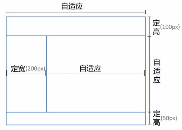
# 全屏布局
<body>
    <div class="parent">
        <div class="top">top</div>
        <div class="middle">
            <div class="left">left</div>
            <div class="right">
                <div class="inner">right</div>
            </div>
        </div>
        <div class="bottom">bottom</div>
    </div>
</body>
2
3
4
5
6
7
8
9
10
11
12
position
html, body, .parent {
    margin: 0;
    height: 100%;
    overflow: hidden;
}

.top {
    position: absolute;
    top: 0;
    left: 0;
    right: 0;
    height: 100px;
    background: blue;
}

.left {
    position: absolute;
    left: 0;
    top: 100px;
    bottom: 50px;
    width: 200px;
    background: red;
}

.right {
    position: absolute;
    left: 200px;
    top: 100px;
    bottom: 50px;
    right: 0;
    background: pink;
    overflow: auto;
}

.bottom {
    position: absolute;
    left: 0;
    right: 0;
    bottom: 0;
    height: 50px;
    background: black;
}

.right .inner {min-height: 1000px;}
1
2
3
4
5
6
7
8
9
10
11
12
13
14
15
16
17
18
19
20
21
22
23
24
25
26
27
28
29
30
31
32
33
34
35
36
37
38
39
40
41
42
43
44flex
html, body, .parent {
    margin: 0;
    height: 100%;
    overflow: hidden;
}

.parent {
    display: flex;
    flex-direction: column;
}

.top {
    height: 100px;
    background: blue;
}

.bottom {
    height: 50px;
    background: black;
}

.middle {
    flex: 1;
    display: flex;
}

.left {
    width: 200px;
    background: red;
}

.right {
    flex: 1;
    overflow: auto;
    background: pink;
}

.right .inner {min-height: 1000px;}
1
2
3
4
5
6
7
8
9
10
11
12
13
14
15
16
17
18
19
20
21
22
23
24
25
26
27
28
29
30
31
32
33
34
35
36
37
38flex

html, body, .parent {
    margin: 0;
    height: 100%;
    overflow: hidden;
}

.parent {
    display: flex;
    flex-direction: column;
}

.top {
    background: blue;
}

.bottom {
    background: black;
}

.middle {
    flex: 1;
    display: flex;
}

.left {
    background: red;
}

.right {
    flex: 1;
    overflow: auto;
    background: pink;
}

.right .inner {min-height: 1000px;}
1
2
3
4
5
6
7
8
9
10
11
12
13
14
15
16
17
18
19
20
21
22
23
24
25
26
27
28
29
30
31
32
33
34
35
# 响应式
<meta name="viewport" content="width=device-width, initial-scale=1.0, user-scalable=no" />
@media: <media_query_list>:媒体查询
@media screen and (max-width:320px) {
    /* 视窗宽度<=320px 时应用以下样式 */
}

@media screen and (min-width:769px) {
    /* 视窗宽度>=769px 时应用以下样式 */
}

@media screen and (min-width:769px) and (max-width:1000px) {
    /* 769px<=视窗宽度<=1000px 时应用以下样式 */
}
1
2
3
4
5
6
7
8
9
10
11